Top Eleven Dollars & Sense Charts and Graphs of 2016

This article is from Dollars & Sense: Real World Economics, available at http://www.dollarsandsense.org

This is a web-only article.
Subscribe Now
at a 30% discount.
We’re getting to the end of the year, and you know what that means. ’Tis the season for Top Ten lists! Here at Dollars & Sense, we try to tell the most important stories about economic life, in the United States and around the world, in a number of different ways. And one of those ways is charts and graphs.
Here we have compiled our favorite graphs from the past year of Dollars & Sense. They’re not in rank order, so it’s not a countdown to the #1 Greatest Graph of the Year. Rather, we think that, together, these charts and graphs present a compelling picture of current economic issues. (This year our graph-rich articles focused mostly on the United States, but we covered plenty of places outside the U.S., including the Spanish left, Brexit in historical context, the crisis of European social democracy (here and here), and the so-called “emerging economies.”) And again, for the third year in a row, we invoke the spirit of Nigel Tufnel and cranked it up to eleven.
Several of this year’s graphs (numbers 1–4 and 7) draw on the series of “Economy in Numbers” columns that UMass-Amherst professor and D&S columnist Jerry Friedman wrote on the economic effects of implementation of Bernie Sanders’ proposed policies (here, here, and here). (Last year’s top eleven list ended with a graph showing projected federal spending as a percent of GDP under the Sanders’ program, from the first inJerry’s series of columns). As many readers may know, Jerry’s projections were harshly criticized by establishment economists backing the Hillary Clinton campaign, and defended by heterodox economists and left journalists. (For more information on the kerfuffle, see a series of posts on the D&S blog, here, here, here, here, and here.)
Since many on the left have been saying that “Sanders Would Have Won,” revisiting Jerry’s macroeconomic predictions can give us a bittersweet reminder of what might have been as we close out this annus horribilis. —Chris Sturr, co-editor
(Note: Not all of the articles featuring these graphs are posted online. To order back issues, click here, or subscribe to see what you’ve been missing.)
Real Wage Growth Renewed Under Sanders Program

1 The Sanders program could have ended wage stagnation.
Senator Bernie Sanders proposed an ambitious program of social reform, including regulatory changes to raise wages and protect workers’ rights, progressive tax reforms, and universal health insurance (Improved Medicare for All). Taken together, these policies could not only have dramatically increased employment and national income, but also raised wages, reduced poverty, and narrowed the gap between rich and poor Americans.
Friedman estimated that, under the Sanders program, real wages would have grown by 2.5% a year, returning to the growth rates of the late 1990s. Faster wage growth would have resulted from 1) faster economic growth, which would have raised wages by improving the bargaining position of workers, and 2) government regulations restoring the real value of the minimum wage and protecting workers’ rights to overtime pay, equal pay for women, and workers’ right to organize unions. In addition, universal health insurance financed through progressive taxation would have lifted the burden of health insurance premiums off workers and employers, freeing up employers’ expenses on labor to be paid in higher money wages.
(From: Gerald Friedman, Economy in Numbers, What Would Sanders Do? Pt. II: Wages, Poverty, and Inequality, January/February 2016.)
Source of Wage Increase Under Sanders Program (including CBO projections), 2015-26
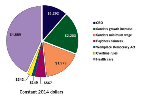
2 Faster growth, pro-worker regulation, and universal health insurance that Sanders proposed would all have helped push wages up. CBO economic forecasts imply that annual real wages for the average American worker will grow by about $1,300, or about 3%, for the next decade as a whole. Faster growth under the Sanders program would have added about another $2,200 in average wages. Regulatory programs, notably a higher minimum wage, would have added nearly another $3,000—still more for women who would benefit from new pay-equity regulations. Finally, universal health insurance would have added nearly another $5,000 for workers who would no longer have to pay private health insurance premiums. Only a small increase could have been expected in average wages from the Workplace Democracy Act—which would have established card-check unionization and first-contract arbitration—because these policies would likely do little to increase union membership.
(From: Gerald Friedman, Economy in Numbers, What Would Sanders Do? Pt. II: Wages, Poverty, and Inequality, January/February 2016.)
Sanders Tax Program, Ten-Year Revenue Forecasts

3 Sanders’ proposed taxes on the wealthy could have paid for widely shared benefits. Sanders would have financed expanded infrastructure, universal free pre-K education, free public higher education, universal health insurance, and other programs with progressive taxation and through the elimination of tax deductions for rich individuals and large corporations. While the benefits of the increased spending would have been widely shared, increases in income taxes and other targeted tax changes would have been borne mostly by the richest Americans; almost half of the tax changes would have been paid by the richest 5% and nearly 30% by the richest 1%. In addition, measures like a financial transactions tax and elimination of favored tax treatment for fossil fuels would have promoted greater economic efficiency by discouraging economically and environmentally harmful activities.
(From: Gerald Friedman, Economy in Numbers, What Would Sanders Do? Pt. II: Wages, Poverty, and Inequality, January/February 2016.)
How the Sanders Program Would Have Reduced Inequality

4 Sanders’s regulatory and tax programs would have sharply reduce inequality. The ratio of the average income of the richest 5% to that of the poorest 20% has increased from less than 11:1 in the early 1970s to about 23:1 today. Economic policy and growth rates forecast by the CBO would allow this ratio to widen further—to over 27:1 by 2026. While faster economic growth due to the Sanders program would narrow differentials slightly, this effect is limited because faster growth also increases corporate profits. By raising wages at the bottom, the Sanders regulatory program—especially the higher minimum wage—would do much more to reduce inequality. By ensuring that the rich pay their fair share of taxes, meanwhile, Sanders’s progressive-taxation program will also dramatically bring down inequality.
(From: Gerald Friedman, Economy in Numbers, What Would Sanders Do? Pt. II: Wages, Poverty, and Inequality, January/February 2016.)
Sources: Author calculations based on “The 2015 Long-Term Budget Outlook,” Congressional Budget Office, (cbo.gov); Gerald Friedman, “Estimating Cost and Revenues for Sanders Single-Payer,” research report, January 31, 2016 (available here).
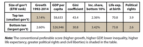
Size of Government and Economic Performance
Sources: James Gwartney, Robert Lawson, and Joshua Hall, Economic Freedom of the World: 2015 Annual Report, Fraser Institute, 2015; Freedom House, “Discarding Democracy: Return to the Iron Fist—Freedom in the World 2015” (freedomhouse.org); Robert Lawson, “Economic Freedom in the United States and Other Countries,” in Donald Boudreaux, ed., What America’s Decline in Economic Freedom Means for Entrepreneurship and Prosperity (Fraser Institute, 2015).
5 If the goal is a more prosperous nation with greater equality, longer life-spans, and more political rights and civil liberties, then a large government is called for. The economies of the ten best-scoring countries on size of government of the Economic Freedom of the World report (from first to tenth: Hong Kong, Bangladesh, Honduras, Madagascar, the Philippines, Nepal, Haiti, Guatemala, Nicaragua, and Pakistan), on average, did grow more quickly than those of the ten countries that did worst by that measure (from 148th to 157th: Finland, Algeria, Netherlands, Denmark, Belgium, France, Timor-Leste, the Republic of Congo, Burundi, and Finland). But the average income per capita for the EFW’s worst ten countries was more than four times as great as for the EFW’s best ten countries on the government-size measure. Also, the overall levels of income inequality (according to the standard measure, the Gini coefficient) were lower and the income share of the poorest 10% of the population was larger. In addition, the average lifespans in the countries the EFW ranked worst were three years longer than for those living in the countries the EFW ranked best. Finally, according to Freedom House, political rights and civil liberties are greater in the countries with the largest-size governments than in those with the smallest-size governments.
(From: John Miller, Up Against the Wall Street Journal, “Maximum ‘Economic Freedom’: No Cure for Our Economic Ills,” January/February 2016.)
Active Private Equity Firms, Globally, 2000–2014

6 The number of private equity firms has increased dramatically since 2000. Between 2000 and 2014, U.S. private equity firms invested $5.2 trillion in 32,200 leveraged buyouts that affected some 11.3 million workers in U.S. companies—considerably more than the number of workers who are currently union members. Over that period, the number of active PE firms globally grew from under 1,500 to over 3,500—a 143% rise. And, while PE investments fell sharply during the Great Recession, they have since largely recovered their pre-crisis levels. Currently, there are 3,883 U.S. private equity firms and 12,992 PE-owned companies headquartered in the United States.
(From: Rosemary Batt and Eileen Appelbaum, Feature, “How Private Equity Works and Why It Matters,” January/February 2016.)
Projected Net Effect on Incomes,
Sanders Single-Payer Program, 2017

Sources: Gerald Friedman, “Funding HR 676: The Expanded and Improved Medicare for All Act: How We Can Afford a National Single-Payer Health Plan,” July 2013, Physicians for a National Health Program (pnhp.org); Internal Revenue Service, Sources of Income, 2013; Congressional Budget Office, Long Term Budget Outlook, 2015 (cbo.gov), 2015 Milliman Medical Index, Physicians for a National Health Program, May 2015 (pnhp.org).
7 Lower- and middle-income people would benefit from cost reduction under single-payer. This graph describes an individual or family of four that pays the employee portion of the premium for employer-provided insurance and that uses their health coverage at least up the amount of the deductible. So their total health-care costs are equal to their premium plus the deductible. (The Milliman Medical Index for 2015 puts health expenses for a “typical” family of four with employer-provided PPO health insurance at over $10,000 per year. The method here gives a more modest total, about $8,000.)
Under single payer, individuals and families would no longer face costs like insurance premiums or out-of-pocket expenses up to their deductible. They would face additional taxes. In the scenario described here, though, for lower- and middle-income people the reduction in their costs would be greater than the added taxes they would pay, so they would experience a net financial benefit.
(From: Gerald Friedman, Economy in Numbers, Bernie Sanders’ Health Care Revolution, March/April 2016.)
Effect of Government Transfers and Federal Taxes
on Income Inequality, 1979–2011

Sources: “The Distribution of Household Income and Federal Taxes, 2011,” Congressional Budget Office, Nov. 2014; Kevin Perese, “The Distribution of Household Income, Federal Taxes, and Government Spending,” Congressional Budget Office, June 18, 2015; Enrique Lamas and Trudi Renwick, “Economic Inequality,” U.S. Census Bureau, July 2015.
8 Democrats and Republicans share responsibility for increasing inequality. In 1980, federal tax and spending policies reduced market inequality by about one-fourth (25.2%). But after eight years of Reagan’s government bashing policies, that effect was down to just over one-fifth (20.8%).
During the administration of George H.W. Bush, the effect of redistribution grew, reaching 23.2% in 1992. But Clinton’s budget slashing policies reduced the redistributive effect of government spending and taxes to 20.7% (slightly lower than at the end of the Reagan years).
During the George W. Bush administration, market inequality and after-tax inequality continued to increase, though more slowly than under Reagan and Clinton. By 2007, government tax and spending policies were doing no more to reduce inequality than they had at the end of the Reagan and Clinton administrations, cutting inequality by just over one fifth, 20.7% in 2000 at the beginning of the Bush years and 20.8% in 2007.
In 2011, after the first three years of the Obama administration, inequality of CBO market incomes was back up to its 2007 level, but inequality of after-tax income remained 6% below its 2007 peak. (Unfortunately, the CBO data end in 2011.)
(From: John Miller, Up Against the Wall Street Journal, Criminal Inequality: Progressives Are Not Guilty, May/June 2016.)
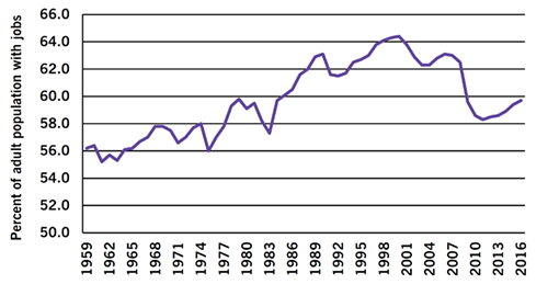
Employment-Population Ratio, 1959–2016
Source: Bureau of Labor Statistics, “Employment Situation—August 2016” (bls.gov).
9 The employment-population ratio continues to decline. The share of the adult population (ages 16 and over) with jobs rose steadily from the mid-1960s until around 2000, from about 55% to over 64%. This increase came largely because the entrance of millions of women into the paid labor force, which more than made up for the withdrawal of many elderly workers and delayed entry of increasing numbers of young people attending college. Around the time of the recession of 2001, however, trends reversed. The employment-population ratio fell between 2001 and 2004, and then plummeted with the “Great Recession” of 2007–9. Since then, job growth has barely been sufficient to keep up with the growth in the population, and the employment-population ratio remains under 60%, a rate previously passed way back in 1986.
(From: Gerald Friedman, Economy in Numbers, “Another Bad Jobs Day,” September/October 2016.)
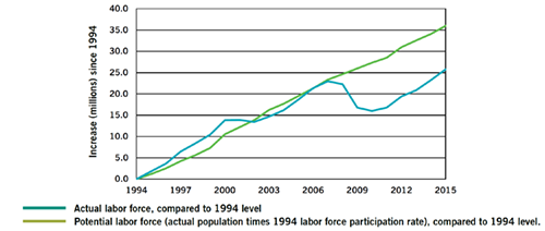
Actual Employment vs. Labor Force Potential, Current Year Compared to 1994 Level
Sources: Bureau of Labor Statistics, “Employment Situation—August 2016” (bls.gov); Congressional Budget Office. “Revisions to CBO’s Projection of Potential Output Since 2007,” Congressional Budget Office, February 2014 (cbo.gov).
10 Job growth is not keeping up with population growth. Because of natural population growth and immigration, the number of Americans available for work increases by over 100,000 per month. (This is despite the sharp drop in immigration with the recession.) During the economic expansion from 1994 to 2001, employment grew a little faster than the population and the labor force participation rate grew. Through 2007, the number of new jobs kept up with the population. With the economic crisis beginning in 2007, however, the number of jobs plummeted, millions abandoned the search for work, and, even after the recovery began in 2010, new job creation has remained relatively feeble. By 2011, the number of new jobs had lagged behind population growth so that eleven million more people had given up searching for jobs. Recovery since then has reduced this number somewhat, but if the share of the adult population employed or looking for work were as high as it was in 1994, there would be ten million more people in the labor force.
(From: Gerald Friedman, Economy in Numbers, “Another Bad Jobs Day,” September/October 2016.)
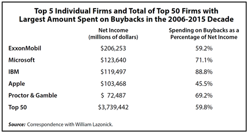
11 The 21st-century U.S. industrial economy has become a “buyback economy.” During the decade ending in 2015, large firms with familiar names dominated in terms of the amount spent on buybacks (as shown in the table). ExxonMobil led, spending $206.3 billion on buybacks during this period, amounting to nearly 60% of its net income (profits after taxes). Then came Microsoft and IBM, with the latter’s spending on buybacks amounting to 89% of its net income. For the top fifty firms in terms of amount spent on buybacks, the total spending was $3.7 trillion in the years 2006-2015, an amount equal to 60% of their total net income over that period.
(From: Arthur MacEwan, Ask Dr. Dollar, “Stock Buybacks: Any Positive Outcome?” November/December 2016.)
Did you find this article useful? Please consider supporting our work by donating or subscribing.
