
Top Eleven Dollars & Sense Graphs of 2015

This article is from Dollars & Sense: Real World Economics, available at http://www.dollarsandsense.org

This article is a web-only article.
Subscribe Now
at a 30% discount.
We’re getting to the end of the year, and you know what that means. ’Tis the season for Top Ten lists! Here at Dollars & Sense, we try to tell the most important stories about economic life, in the United States and around the world, in a number of different ways. And one of those ways is graphs.
Here we have compiled our favorite graphs from the past year of Dollars & Sense. They’re not in rank order, so it’s not a countdown to the #1 Greatest Graph of the Year. Rather, we think that, together, these graphs present a compelling picture of current economic issues.
For the second year in a row, in the spirit of Nigel Tufnel, we’ve cranked it up to eleven.
(Note: Not all of the articles featuring these graphs are posted online. To order back issues, click here, or subscribe to see what you’ve been missing.)
Total Number of ICSID Cases Registered, by Calendar Year

Note: Includes ICSID Convention Arbitration Cases and ICSID Additional Facility Arbitration Cases.
Source: The ICSID Caseload–Statistics (Issue 2014-2).
1 A 1964 “no” vote by 21 developing countries against the World Bank has been vindicated by history. Fifty years ago, at the 1964 World Bank annual meeting in Tokyo, 21 developing-country governments voted “no” on the convention to set up a new part of the World Bank Group where foreign corporations could sue governments and bypass domestic courts. It was to be called the International Centre for Settlement of Investment Disputes (ICSID). The 21 included all of the 19 Latin American countries attending, as well as the Philippines and Iraq.
The ICSID treaty went forward, despite the “no” votes. The Tokyo No criticisms were prescient in terms of the track record of ICSID in the ensuing decades. ICSID moved center-stage in the wake of the neoliberal bilateral and multilateral trade and investment agreements that expanded starting in the 1980s. Forty years after ICSID’s first case was filed in 1972, a record 48 new arbitration cases were added to ICSID’s docket in 2012. To put this in perspective, the number of cases registered never reached five in any year between 1972 and 1996. Since 2003, the number has been over twenty every single year. The last three years for which data have been published, 2011-2013, have the three highest figures to date, with at least 37 cases registered each year.
(From: Robin Broad, Comment, “Remembering the ‘Tokyo No’, Fifty Years Later” January/February 2015.)
Actual Unemployment Rate vs.
Non-Accelerating Inflation Rate of Unemployment

Source: Bureau of Labor Statistics (bls.gov).
2 Unemployment has been high in the United States in the neoliberal era. From 1947 to 1974, policy makers sought to keep unemployment low, with a full-employment target rate ultimately set at 4% during the Kennedy administration. While unemployment rates were above this level in most years, the economy did reach full employment in the late-1940s, during the early and mid-1950s, and in the 1960s. Since the 1970s, however, policy makers have abandoned the full-employment target and sought only to hold unemployment to the so-called Non-Accelerating Inflation Rate of Unemployment (NAIRU), or a level high enough to prevent acceleration in wage and price inflation. Even this level has been reached only briefly since 1974—for a few months in 1978, briefly at the end of the 1980s and in 2006, and most significantly in the late 1990s.
(From: Gerald Friedman, Economy in Numbers, “The Costs of Austerity: Unemployment and Economic Losses in the Neoliberal Era,” January/February 2015.)
Distribution of Income in the Global Coffee Economy
(% of Income)
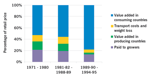
Source: John M. Talbot, “Where Does Your Coffee Dollar Go? The Division of Income and Surplus along the Coffee Commodity Chain,” Studies in Comparative International Development, Vol. 32, No. 1 (1997), Tables 1 and 2.
Note: Data for 1971–1980 are for calendar years. Data for 1981–82 to 1988–89 and for 1989–90 to 1994–95
are for “coffee years” (Oct. 1–Sept. 30). Percentages of total retail price (reported by Talbot (1997) for calendar years (1971–1980) or coffee years (1981–82 to 1988–89 and 1989–90 to 1994–95) were used to calculate means for intervals shown. Figures calculated did not add exactly to 100.0% due to rounding (in all cases between 99.9% and 100%). Bar graphs show each income category as percentage of sum of four income categories.
3 The global coffee economy is marked by severe inequalities in wealth and power. International traders and roasters operate in a very uncompetitive market setting—they are monopolists. The six largest coffee trading companies control over 50% of the marketplace at the trading step along the coffee chain (Neumann Kaffee Gruppe from Germany and ED&F Man based in London are the largest international traders). The roasting stage of coffee production is even more concentrated, with only two companies (Nestle and Phillip Morris) controlling almost 50% of the market. Market power gives these modern-day robber barons influence over prices and other terms of trade, allowing them to place downward pressure on prices they pay to farmers, and upward pressure on the prices they charge to consumers. This inequality in market power introduces inequalities in incomes and standards of living between different actors in the coffee economy. Unsurprisingly, farmers operating in the shadow of the big traders and roasters have relatively low incomes and standards of living. By contrast, owners, managers, and some workers at the big coffee monopolies enjoy relatively high incomes and standards of living. There are also race and gender dimensions to consider: coffee farmers are disproportionately women of color, while owners and managers in the big coffee monopolies are generally white men. There is also a strong North-South dimension to this power inequality—coffee farmers from Latin America, Africa, and Asia compete fiercely with one another, their incomes undermined by the pricing power of monopolies headquartered in Europe and the United States.
(From: Sasha Breger-Bush, Feature, “No Friendship in Trade: Farmers Face Modern-Day Robber Barons, in the United States and Worldwide,” March/April 2015.)
Differences in Adult Outcomes, Children Who Received SNAP Compared to Those Who Did Not

Source: Hilary W. Hoynes, Diane Whitmore Schanzenbach, and Douglas Almond, “Long Run Impacts of Childhood Access to the Safety Net,” National Bureau for Economic Research (NBER), November 2012.
Note: From sample of individuals born 1956-1981 into “disadvantaged families” (household head had less than a high-school education).
4 SNAP (Food Stamps) increases food security and has lasting beneficial effects. While 26% of food-insecure households report using food pantries and 3% use soup kitchens, the federal Supplemental Nutrition Assistance Program (SNAP) is the largest source of food assistance. Even SNAP’s $70 billion is only enough to provide $125 in food assistance per person per month, barely $1.30 per meal. SNAP reduces the incidence of food insecurity, but it still leaves 49 million people in food-insecure households. Despite these limitations, SNAP has both immediate and lasting benefits. Households that receive SNAP benefits eat better and have better health than similar households that do not. When aid is provided to households with young children, these benefits persist throughout the lifetimes of recipients. Those who receive assistance are healthier as adults and are more likely to finish high school, compared to those who do not.
(From: Gerald Friedman, Economy in Numbers, “Food Insecurity in Affluent America,” March/April 2015.)
The Greek Financial Account: Capital Flight from 2010 to 2012

Source: Greek Article IV Report, IMF June 30, 2013 in billions of euros.
Note: “Other” refers mostly to bank accounts.
5 When short-term investment dominates, foreign creditors hold the debtor nation hostage. The fact that investors from other European countries were willing to lend to Greece was not the problem. Rather, the problem was the short-term nature of the loans. There are basically two types of foreign investment: short-term and long-term. Portfolio investment and foreign bank accounts are both short-term purchases of paper assets. Foreign direct investment, on the other hand, involves an institution in a creditor nation opening a physical business in Greece as a subsidiary, or engaging in a joint venture with a Greek business partner. Without the option of a quick and easy exit, the direct investor has more of a stake in ensuring the growth of the business activity undertaken in Greece.
In 2008, foreign lenders provided Greece with short-term funds to the tune of 16.4 billion euros, while foreign direct investment was barely one-tenth that amount, only 1.7 billion euros! Such a predominance of foreign portfolio investment and bank accounts is problematic because the flow can reverse in the time it takes to push a button on a computer, giving the portfolio investor incentive to flee at even the slightest hint of trouble. As Figure 2 shows, net portfolio investment demonstrated its short-term nature by turning negative—into a net outflow from Greece—in 2010. The outflow reached panic proportions by 2012.
(From: Marie Duggan, Feature, A Way Out for Greece and Europe: Keynes’ Advice from the 1940s, May/June 2015.)
Economic Growth, Selected Latin American Countries, 1951–2013
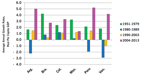
Source: Economic Commission for Latin America and the Caribbean (ECLAC); World Bank, World Development Indicators.
Note: Figures calculated as averages of annual growth rates.
6 Neoliberal economic policies in Latin America resulted in slower economic growth. In the 1970s and 1980s, Latin American governments adopted neoliberal—“free market” and “free trade”—economic policies, despite three previous decades of rapid economic growth under import-substitution policies. From 1951 to 1979, the annual growth rate in per capita income averaged 2.7%, led by Brazil’s average of over 4%. Growth dropped precipitously in the 1980s—known as the “lost decade.” Per-capita income fell throughout the region under the impact of IMF-imposed austerity programs. While economic growth revived in the 1990s, it was only in the early 2000s, after the election of center-left governments across Latin America (known as the “pink tide”), that the continent returned to the rapid growth rates of the pre-Washington Consensus period. One country that has not abandoned neoliberal policies is Mexico, the only large country in the region where economic growth has not accelerated significantly since 2003.
(From: Gerald Friedman, Economy in Numbers, “The Slow Burn: The Washington Consensus and Long-Term Austerity in Latin America,” July/August 2015.)
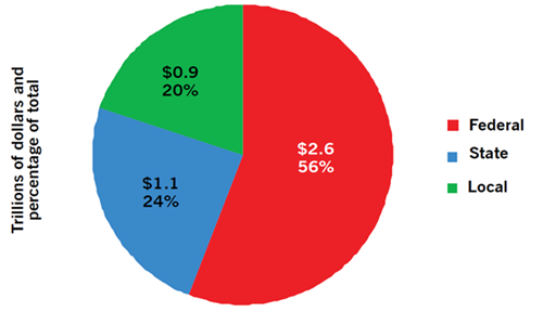
7 The federal government collects only a little more than half of government revenues. The federal government and its taxes—totaling nearly $2.6 trillion (or 56% of government revenue)—have often been the focus of political attention and controversy. State and local governments, however, collect nearly $2 trillion in taxes and other types of revenue. (Non-tax revenue includes charges for services (such as water, the lottery, or college tuition) as well as fees (such as motor vehicle registrations or licenses).) States and localities collect 44% of total government revenues. Therefore, to understand the distributional impact of government revenue policies in the United States, we have to consider all levels of government, not just the federal.
(From: Gerald Friedman, Economy in Numbers, The Burdens of American Federalism, September/October 2015.)
Average Industrial Air Toxics Exposure (EPA score)
by Poverty and Minority Status, Ten EPA Regions
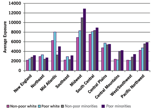
Source: Klara Zwickl, Michael Ash, and James K. Boyce, “Regional Variation in Environmental Inequality: Industrial Air Toxics exposure in U.S. Cities,” Ecological Economics, (107), 2014.
8 America’s polluters are not color-blind, nor are they oblivious to distinctions of class. Industrial air pollution varies greatly across regions of the country. The Midwest and South Central regions have the highest levels, reflecting historical patterns of both industrial and residential development. The figure below shows average pollution exposure by region for four groups: non-poor whites, poor whites, non-poor minorities and poor minorities. Poor minorities consistently face higher average exposure than non-poor minorities, and in most regions poor whites face higher average exposure than non-poor whites. In general, poor minorities also face higher exposure than poor whites, and non-poor minorities face higher exposure than non-poor whites. But in mapping environmental injustice we do find some noteworthy inter-regional differences—for example, in the contrast between racial disparities in the Midwest and Mid-Atlantic regions—that point to the need for location-specific analyses.
(From: Klara Zwickl, Michael Ash, and James K. Boyce, Making Sense, “Mapping Environmental Injustice: Race, Class, and Industrial Air Pollution,” November/December 2015.)
States arranged by rank on key economic measures
affecting African Americans, worst to best.
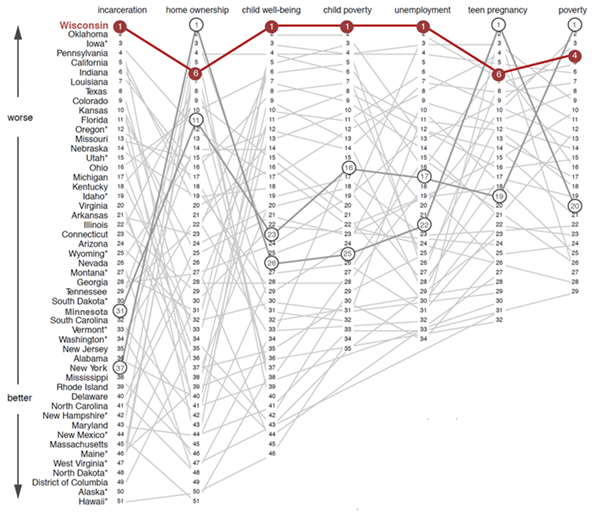
Sources: Employment & Training Institute, University of Wisconsin-Milwaukee;
Kaiser Family Foundation; Ecomomic Policy Institute; Guttmacher Institute;
Annie E. Casey Foundation; and Corporation for Enterprise Development. Graphic created for Dollars & Sense by Big Lake Data (biglakedata.com.)
Note: Some of the rankings do not include all 50 states (plus D.C.) because data are incomplete, inconclusive, or statistically insignificant for the missing states.
9 Wisconsin is the worst. At first glance, the realities facing Wisconsin’s black residents seem to be on par with those in the rest of the country. Nationwide, black Americans trail their white counterparts in unemployment by a two-to-one ratio, make 60% of the average household income of whites, and have just 8% of the wealth of the average white household. Housing segregation is still common in many major American cities. Black incarceration rates far exceed those for whites—particularly for drug-related crimes.
But a review of major studies published in the past few years suggests that Wisconsin’s black population has fallen to the back of the pack. The state has the highest rate of black unemployment in the nation and the highest rate of black incarceration. Black children are ranked the lowest in the country for overall well-being. And in categories where it fails to be the very worst, it falls short by inches; the Dairy State is also close to having the highest rates of black poverty and teen pregnancy in the nation.
Stated otherwise: from a socioeconomic perspective, Wisconsin has become one of the worst places in the United States to be black.
(From: Daniel Schneider, Feature, The Worst Place in the U.S. to Be Black Is...Wisconsin, November/December 2015.)
Annual Growth Rates of Wages and Salaries
and Corporate Profit, Four Postwar Periods
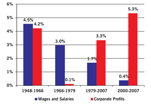
Source: U.S. Bureau of Economic Analysis, NIPA Tables 1.14, 1.1.4, 2013, (bea.gov); U.S. Bureau of Labor Statistics, 2013 (bls.gov).
10 Neoliberalism produced rapidly growing inequality. Big business could not have effectively argued that wages must fall so that profits could rise, that welfare recipients were too rich while CEOs were too poor, that the unemployment rate should be driven up so that wages could be driven down, or that American workers should be forced into a “race to the bottom” with the poorest workers in the world. However, neoliberal restructuring of American and global capitalism achieved all those aims by promising great economic benefits for all citizens once the magic of the “free market” was unleashed.
For some 25 years, neoliberal capitalism in the United States produced long, if tepid, economic expansions with low inflation. While the rich got richer at an astonishing and accelerating rate, the majority did not fare well. As long as neoliberal capitalism was delivering rising profits and growing riches for those at the top, however, it was difficult for critics to make much headway against it. As neoliberal restructuring undermined labor’s bargaining power, real wages stagnated; this allowed profits to recover from their long decline. The big gap emerging, after 1979, between profit growth and wage and salary growth jumped sharply upward after 2000.
(From: David Kotz, Feature, A Great Fall: The Origins and Crisis of Neoliberalism, November/December 2015.)
Projected Federal Spending, Percent of GDP,
CBO Estimates vs. with Sanders Program
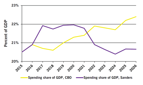
Source: Author’s calculations; 2015 Long-Term Budget Outlook, Congressional Budget Office, accessed September 21, 2015.
11 Under Bernie Sanders’ proposals, government spending would decline relative to GDP within the decade. No one should be surprised by the popular support that Sen. Bernie Sanders (I-Vt.) has attracted in his run for president as a democratic socialist. Nor should we be surprised that he has drawn attacks charging that his policies will bankrupt the United States. Sanders’ proposals for infrastructure, early-childhood education, higher education, youth employment, family leave, private pensions, and Social Security would total over $3.8 trillion over ten years. While this is a large number, it would be barely 6% of federal spending for 2017-2026. Apart from any benefits these programs would bring directly, their cost would be reduced in four ways: Two operate by offsetting current spending and tax policies—either replacing existing federal spending or reducing tax breaks currently subsidizing private spending. The other two, which account for over 70% of the cost reduction, are the “dynamic effects” of increased economic growth—boosting tax revenues and reducing federal safety-net spending when the economy expands.
Federal spending would initially increase faster than GDP under the Sanders program. After 2021, however, federal spending would be lower as a percentage of GDP than it would be under Congressional Budget Office (CBO) projections, because of the strength of the economic recovery engendered by the Sanders stimulus. This is actually a conservative estimate of the boost to GDP because it does not include the productivity-raising effects of infrastructure spending and increased education.
(From: Gerald Friedman, Economy in Numbers, What Would Sanders Do?, November/December 2015.)
Did you find this article useful? Please consider supporting our work by donating or subscribing.