Top Eleven Dollars & Sense Graphs of 2014

This article is from Dollars & Sense: Real World Economics, available at http://www.dollarsandsense.org

This is a web-only article.
Subscribe Now
at a 30% discount.
We’re getting to the end of the year, and you know what that means. ’Tis the season for Top Ten lists! Here at Dollars & Sense, we try to tell the most important stories about economic life, in the United States and around the world, in a number of different ways. And one of those ways is graphs.
Here we have compiled some of what we consider the best graphs from the past year of Dollars & Sense. They’re not in rank order, so it’s not a countdown to the #1 Greatest Graph of the Year. Rather, we think that, together, these graphs present a compelling picture of current economic problems.
There were lots to choose from, in our Economy in Numbers column and other articles, and we couldn’t narrow the list down to just ten. So, in the spirit of Nigel Tufnel, we’ve cranked it up to eleven.
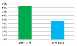
(1) Since the 1970s, tax rates for the rich have been cut dramatically. Tax rates soared to help pay for World War II. They were kept at a high level through the 1960s as a tool to finance New Deal and Great Society programs and to redistribute income. Capital-gains tax rates (not shown here) were cut under President Carter in 1978, and this was followed by dramatic cuts in the top marginal federal income tax rate (the top tax bracket) under Reagan in the 1980s. Despite small increases under Clinton and Obama, the top tax rate—the rate paid on incomes of over $457,600 for a married couple or $406,750 for a single person—remains less than half as high as in the 1950s under Republican President Dwight Eisenhower. (Gerald Friedman, Economy in Numbers, “The Rules of the Game: From Regulated to Neoliberal Capitalism,” November/December 2014)
Figure 1: Top Marginal Federal Income Tax Rate, Averages for Two Periods
Source: Tom Petska and Mike Strudler, Statistics of Income Division, Internal Revenue Service, “Income, Taxes, and Tax Progressivity: An Examination of Recent Trends in the Distribution of Individual Income and Taxes” (irs.gov).
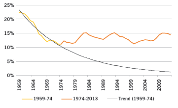
(2) We were winning the War on Poverty but surrendered. From 1959 to 1973, the poverty level fell from 22% to about 11%. Since then, however, it has drifted back up, to 15% in 2012 (dropping down only slightly since). Had we continued to reduce poverty at the 1959-1974 pace, the poverty rate would now be under 2%, with 41 million fewer people living in poverty. (Gerald Friedman, Economy in Numbers, The Rules of the Game: From Regulated to Neoliberal Capitalism, November/December 2014)
Figure 2: Poverty Rate, Two Periods, Compared to Trend
Source: Census Bureau, Historical Poverty Tables--People (census.gov).
(3) Growth in household wealth has not fueled a robust recovery. On the eve of the Great Recession, household debt payments were an unprecedented 18% of disposable personal income. As the crisis hit, household net worth plunged by over $13 trillion, led by falling home prices, and consumer spending fell accordingly. Since the recession, households have increased saving to bring down their debt levels. While this is good for individual balance sheets, it has meant reduced spending, lowering economy-wide demand and income. Average household wealth has since recovered, but the effect on consumer spending has been muted because most of the recovery has been in stocks, assets which are owned primarily by a small (and rich) portion of the U.S. population. (Gerald Friedman, Economy in Numbers, What Happened to the Recovery? Part II, July/August 2014)
Figure 3: Increase in Household Financial Wealth, by Source, 2009-2013

Source: Federal Reserve, Z.1 Statistical Release for June 5, 2014 (federalreserve.gov.
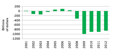
(4) The weak recovery has left an enormous gap between actual and potential output. There was a sharp fall in output (GDP) at the onset of the Great Recession, down to 8% below what the economy could produce if labor and other resources were employed at normal levels (“full employment” capacity). Since the recovery began, output has grown at barely above the rate of growth in capacity, leaving the “output gap” at more than 6% of the economy’s potential—or nearly $1 trillion per year. (Gerald Friedman, Economy in Numbers, What Happened to the Recovery? Part I, May/June 2014)
Figure 4: Output Gap (Actual GDP Minus Potential GDP), Inflation-Adjusted, 2000-2013
Source: Bureau of Economic Analysis, “Real Gross Domestic Product Chained Dollars” (bea.gov); Congressional Budget Office, “Real Potential Gross Domestic Product” (cbo.gov).
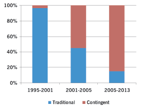
(5) Most new jobs since 2001 have been under contingent arrangements. This is in sharp contrast to the late 1990s, when unemployment rates were low and employers had to offer workers more desirable long-term contracts. With the economic recession of the early 2000s, followed by the Great Recession and the anemic recovery (2007 to the present), however, employers have shunned long-term employment contracts and workers have had to settle. (Gerald Friedman, Economy in Numbers, The Rise of the Gig Economy, March/April 2014)
Figure 5: New Jobs, Traditional vs. Contingent, 1995-2013
Source: General Accounting Office, Contingent Workers: Incomes and Benefits Lag Behind Those of Rest of Workforce (gao.gov); Bureau of Labor Statistics, “Contingent and Alternative Employment Arrangements,” February 2001 (bls.gov).
(6) The Affordable Care Act (“Obamacare”) will not solve our health-care access problems. While the ACA will provide health insurance to millions of Americans, millions of others will remain uninsured. While over 25 million will gain coverage either through the expansion of Medicaid or by buying subsidized private insurance, somewhat more will remain without coverage. Some are not covered by the Act (including undocumented immigrants); others will be excused from the requirement to have insurance because of cost; and still others will not comply. Moreover, because it builds on the existing private health-insurance system, the ACA does little to reduce access problems for people with health insurance. Those with insurance have dramatically fewer problems accessing health care (including seeing doctors, arranging follow-up visits, and filling prescriptions) than those without. But even insured Americans are twice as likely as citizens of countries with public insurance to have trouble getting care. (Gerald Friedman, Economy in Numbers, The ACA and America’s Health-Care Mess, January/February 2014)
Figure 6: Cost-Related Health-Care Access Problems

Source: Survey by the Commonwealth Fund in Cathy Schoen, et al., “Access, Affordability, and Insurance Complexity,” Health Affairs, Nov. 18, 2013.
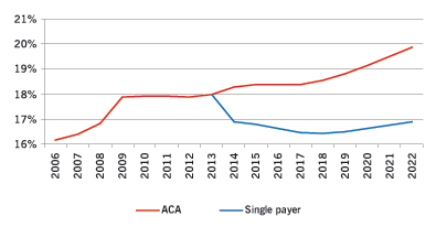
(7) We need a single-payer system to control health-care costs. The ACA does not establish a sustainable health-care finance system in the United States. Under the ACA, health care spending will continue to grow significantly faster than the economy as a whole, and the share of the economy going towards health care will rise in the next decade to nearly 20%. By controlling administrative costs and drug prices, a single-payer system can hold healthcare spending to less than 17% of the GDP. (Gerald Friedman, Economy in Numbers, The ACA and America’s Health-Care Mess, January/February 2014)
Figure 7: Health Care Spending as a Percentage of GDP, ACA vs. Single-Payer 2006-2022
Source: Author’s calculation, see Gerald Friedman, “Funding HR 676: The Expanded and Improved Medicare for All Act. How we can afford a national single-payer health plan,” Physicians for a National Health Plan (pnhp.org).
(8) Cutting Social Security benefits would increase the federal debt. It makes no sense to try to solve the supposed problem of too much government debt by cutting benefits for current and future Social Security recipients. Cutting benefits would mean that payroll taxes would more easily meet retiree benefits, so the surplus accumulating in the Social Security Trust Fund would be greater. Since the Trust Fund is required by law to invest its surpluses in Treasury securities, a greater surplus translates into more bonds being accumulated by the Trust Fund, and therefore a higher gross federal debt (assuming that Treasury borrowing from other sources remains the same). So cutting Social Security benefits in order to reduce the $17 trillion debt would produce the contradictory result that the debt would be even higher than it would have been without the benefit cuts. Had benefits been cut by 13% beginning in1996, total reductions would have totaled $1.2 trillion by 2012. So the Trust Fund would have accumulated that much more in Treasury securities, and the gross debt would actually have increased to $18.2 trillion! (Marty Wolfson, The $17 Trillion Delusion: The Absurdity of Cutting Social Security to Reduce Federal Debt, January/February 2014)
Figure 8: Federal Debt ($ trillions)

Source: The White House, Historical Tables, Table 7.1Federal Debt at the End of Year: 19402019 (whitehouse.gov).
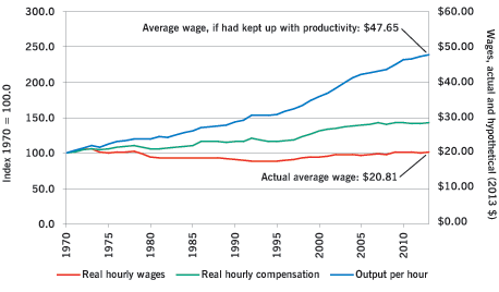
(9) Wages have stagnated despite continued productivity growth. While productivity has increased dramatically, average hourly wages have barely kept up with inflation. Total hourly compensation (including not only wages but also the rising cost of employer-provided health insurance) has increased by just 0.8% a year, still much less than the 2.0% average annual increase in labor productivity. This rise in total compensation does not benefit most current workers, since it is mostly driven by the rising cost of health insurance and higher Social Security taxes to provide for an aging population. Had real wages kept pace with productivity, they would have risen from $19.97/ hour in 1970 (in constant 2013 dollars) to $47.65/ hour in 2013—more than double the actual average real wage of $20.81/hour in 2013. (Gerald Friedman, Economy in Numbers, What Happened to Wages? How Wages Stagnated and Capital Captured Productivity Gains, September/October 2014)
Figure 9: Productivity and Wages, 1970-2013
Source: Economic Report of the President 2014, Tables B15 and B16 (gpo.gov/erp).
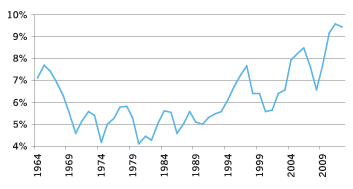
(10) Profits are capturing a rising share of total income. While output, employment, and wages have remained depressed, after-tax corporate profits have soared to about one-tenth of national income. While this continues a trend that goes back to the 1970s, the rising profit rate since the Great Recession reflects how high levels of unemployment allow employers to push employees to work harder and produce more—even without paying higher wages. (Gerald Friedman, Economy in Numbers, What Happened to the Recovery? Part I, May/June 2014)
Figure 10: Corporate Profits, After Tax, Percentage of GDP, 1964-2012
Source: Bureau of Economic Analysis, Table B90. Corporate profits with inventory valuation and capital consumption adjustments, 19642012 (bea.gov).
(11) Income inequality is rising in most high-income countries. In many countries in the world—including most of the high-income countries and the most populous lower income countries—the distribution of income has become more unequal over the last couple of decades. The figure shows the ratio of the total income of the highest-income tenth of the population to the total income of the lowest-income tenth of the population for selected high-income countries. The first thing that stands out is that the U.S. income distribution is substantially more unequal than those of any of the other countries. Also, the absolute increase by this measure of inequality is greatest in the United States. However, with the sole exception of Italy, all the countries shown experienced rising income inequality. (Arthur MacEwan, Ask Dr. Dollar, Inequality in the World, November/December 2014)
Figure 11: Income Ratio, Top 10% to Bottom 10%, Selected High-Income Countries

Source: Organization for Economic Cooperation and Development, Inequality and Income: Data (oecd.org).
Did you find this article useful? Please consider supporting our work by donating or subscribing.
