The Economics of Trump's War with Iran
Just how much damage will the war and its aftermath inflict on the global economy?
The answer to these questions depends on what you mean by "in the world." In many countries in the world--including most of the high-income countries and the most populous lower-income countries--the distribution of income has become more unequal. If we look at the income differences among countries, however, the situation has become more equal because per capita income has generally increased more rapidly in lower-income countries than in higher-income countries--but with important exceptions. And if we look at income distribution among all the people in the world--accounting for inequality both within and between countries--it seems that in recent decades the very high degree of inequality has remained about the same. (Before proceeding, please see the warning in the box below.)

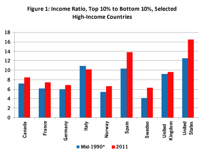
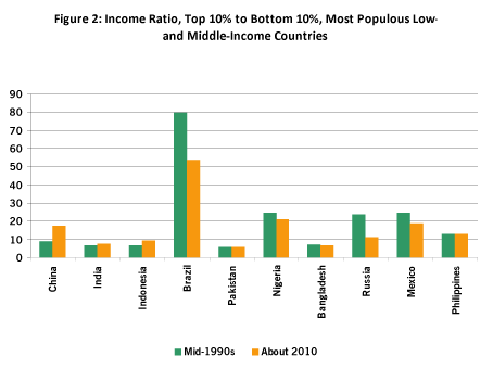
Take a look at Figures 1 and 2, which show the changes in the distribution of income within selected countries, several high-income and several low- or middle-income, over roughly the last two decades. The measure of income distribution used in these graphs is the ratio of the total income of the highest-income tenth of the population to the total income of the lowest-income tenth of the population.

Note: For the U.K. the figure is for 1999; for Spain the figure is for 2004; for France the figure is for 1996. For all others the earlier figures are for 1995. The later U.S. figure is for 2012. Source: OECD.
The first thing that stands out in Figure 1 is that the U.S. income distribution is substantially more unequal than those of any of the other countries. Also, the absolute increase by this measure of inequality is greatest in the United States. However, with the sole exception of Italy, all the countries in Figure 1 experienced rising income inequality.

Note: These countries along with the United States and Japan are the twelve most populous countries in the world. The combined population of these ten accounts for 55% of the world's population in 2014. Source: World Bank.
Things are different in Figure 2, which includes the ten most populous lower-income countries (ten of the twelve most populous countries in the world, the United States and Japan being the other two). First, the degree of inequality is quite high in some of the countries in the graph. Brazil is the extreme case. However, Brazil and most of the other countries in Figure 2 experienced a reduction of inequality in this period--though several are still highly unequal. The most populous countries in Figure 2--China, India, and Indonesia--experienced rising inequality. These three countries are the first, second, and fourth most populous countries in the world (with the United States third).
The data in these two graphs illustrate the widespread rise of income inequality within countries, especially among high-income countries. Among lower-income countries, the picture is mixed. Although Brazil remains highly unequal, the reduction of inequality in Brazil is important because it has been achieved, at least in part, by policies directed at reducing poverty. Brazil's redistributive policies represent a trend in many Latin American countries--a backlash against the neoliberal policies of preceding decades.
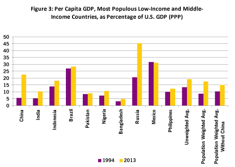
Figure 3 illustrates what has been happening to income distribution among countries and indicates that the situation has become more equal because, in general, lower-income countries have grown more rapidly during the last two decades than have higher-income countries. For 1994 and 2013, the two columns in Figure 3 show Gross Domestic Product (GDP) per capita in the ten most populous low- and middle-income countries (listed by population) compared to GDP per capita in the United States. The comparison is in terms of purchasing power parity (PPP).

Source: World Bank.
For nine of these ten countries--Mexico is the exception--GDP per capita rose more rapidly than in the United States. Taken as a group and using an average weighted by population, these ten countries in 1994 had an average GDP per capita 9% of that in the United States, but by 2013 this figure had risen to 17%. The basic result is not due simply to the remarkably rapid economic growth in China. When China is removed from the group, the weighted average still increases, over this time period, from 10% to 15%. (This general phenomenon is certainly not a universal phenomenon; several very low-income countries have fallen further and further behind.)
So, if countries are our units of observation, Figure 3 illustrates how things have become more equal since the early 1990s. Going back further in time, comparing countries' incomes weighted by population shows inequality dropping pretty much continuously since 1960, and especially sharply since the early 1990s. But if the average is not weighted by population--thus removing the dominance of China, India, and some other very populous countries--the situation among countries only started to become more equal from 2000. Nonetheless, many low-income countries have been left behind in this period, most notably several countries of Africa. The dominant trend is not the exclusive trend.
To obtain a truly global estimate of the distribution of income, it is necessary to compare the incomes of people (or families or households) in the world. Availability of data (as well as other data problems) makes such an estimate rough, but useful nonetheless. Branko Milanovic, perhaps the leading expert on these issues, has shown that, from the mid-1980s to 2011, global inequality remained roughly constant, with a slight decline toward the end of this period--likely explained by the greater slowdown of high-income countries compared to low-income countries in the Great Recession. The relative stability of income distribution would seem to result from a rough balance between the reduction of inequality among countries (Figure 3) and the rise of inequality within countries (Figure 1 and the most populous countries of Figure 2).
Milanovic's estimate uses the Gini coefficient, a standard measure of income inequality. The Gini takes account of incomes of the whole population, unlike the measure used in Figures 1 and 2, which focuses on extremes. The Gini can vary from 0 (everyone has the same income) to 1 (all the income goes to one person). For income distribution in almost all countries, the Gini ranges from about 0.27 (Norway) to about 0.65 (South Africa).
For the global population, over the period of Milanovic's estimates, the Gini varies around 0.70--a higher figure, showing a more unequal distribution, than for any single country. However, if inequality were measured by a comparison of extremes, it is likely that inequality would be rising. There remains a large share of the world's population that continues to live in extreme poverty, while incomes at the very top have sky-rocketed in recent years. But whether the measure is the Gini or a comparison of extremes, the distribution among people in the world is very unequal.
Each of these measures of income inequality "in the world" matters in one way or another. For example, to understand political conflicts within countries, the changes in the distribution within countries is probably most important. To understand how the changing structures of the global economy have affected people's lives in various parts of the world, it is useful to consider all of these measures. And to understand the dynamics of international politics, the measures that focus on inequalities among countries are probably paramount.
The measurements show both some positive and negative changes in the world. On the one hand, the rapid growth of several low-income and middle-income countries has, in spite of the high (and sometimes rising) level of inequality in these countries, pulled many people out of abject poverty. On the other hand, we know that rising inequality within a country tends to undermine social cohesion and generate stress at virtually all levels of society--with damaging effects on health, education, the natural environment, and crime. Even in this era of increased globalization, it is in the national context that inequality has the primary impact on people's behavior and how they judge their well-being.
And no matter how we look at the situation, the world has long been and remains a very unequal place.