
Economy in Numbers
Thirty-Five Years of Economic Indicators
This article is from the November/December 2009 issue of Dollars & Sense: Real World Economics available at http://www.dollarsandsense.org

This article is from the November/December 2009 issue of Dollars & Sense magazine.
Subscribe Now
at a 30% discount.
For many years, the “Economy in Numbers” department provided current data on standard economic indicators: unemployment, wages, interest rates, and so on. Once that data became available in real time online, the department switched gears. This Economy in Numbers returns to its roots—but with data showing the trends over the past 35 years in some key indicators.
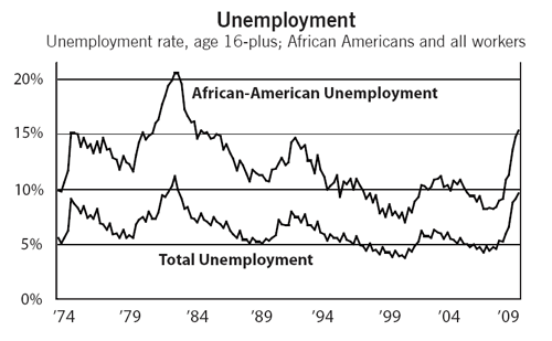
Two deep recessions in the 1970s and 1980s sent the official unemployment rate soaring over 10%, a height it did not approach again until this year. African-American unemployment has been higher, in both “good” times and bad.
Source: Bureau of Labor Statistics, Labor Force Statistics from the Current Population Survey. Note: Not seasonally adjusted, 16 and over.
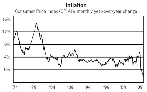
The inflation rate spiked over 10% during the 1970s and early 1980s but has been much lower since. In the current recession, the rate has actually been negative (“deflation”), belying fears of renewed inflation.
Source: Bureau of Labor Statistics, Consumer Price Index.
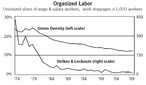
Union density has been falling since the 1950s, but increased employer attacks and anti-labor government policies have sped the decline since the 1980s. Employers’ use of permanent replacements has made strikes difficult to win, and large strikes have become rare.
Sources: Gerald Mayer, Union Membership Trends in the United States, CRS Report for Congress, August 31, 2004, Table A1, Union Membership in the United States, 1930-2003; Bureau of Labor Statistics, Work Stoppages Involving 1,000 or More Workers, 1947-2008.
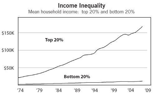
Income inequality has increased dramatically over the last three decades. As the average incomes of lower- and middle-income people have stagnated, the incomes of those at the top have soared.
Source: U.S. Census Bureau, Historical Income Tables—Households, Table H-3, Mean Household Income Received by Each Fifth and Top 5 Percent All Races: 1967 to 2006 (2006 Dollars).
More Economic Indicators:
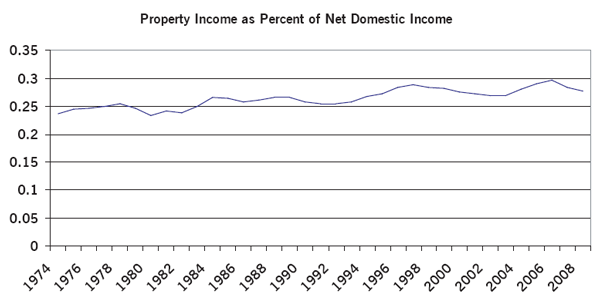
Over the last 35 years, as the decline of unions and the shift toward “pro-business” government policies have tilted the balance of class power in favor of capitalists and against workers, a growing percentage of total income has gone to those who make their incomes from property rather than labor. Forms of income like business profits, rents, dividends, and interest make up a substantially larger share of total income than three decades ago, while wages and other labor income account for a smaller share.
Source: Bureau of Economic Analysis, National Economic Accounts, Table 1.10., Gross Domestic Income by Type of Income .
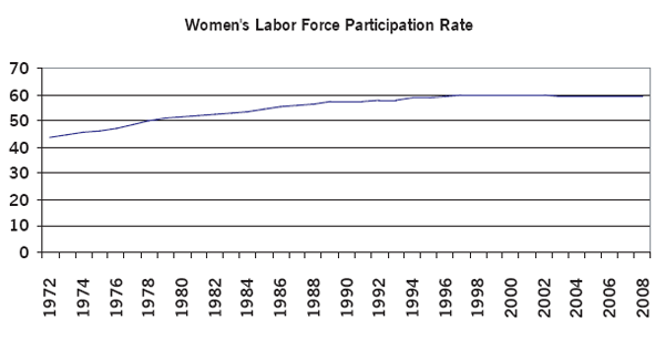
Women’s labor-force participation rate—the percentage of working-age women who either work for pay or are actively looking for paid employment—has grown dramatically since the 1970s. The reasons include increased work opportunities for women, including the growth of employment in some predominantly female occupations and the entry of women into some fields from which they had been previously excluded, along with increasing consumption standards making “two-earner” families the norm. Most of the increase, from a little more than 40% to nearly 60%, took place between the mid 1970s and the early 1990s, with the rate increasing little over the last 15 years or so.
Source: Bureau of Labor Statistics, Labor Force Statistics from the Current Population Survey.

The federal government has run deficits for most of the last 35 years. Deficits that do not rise and fall with the business cycle are known as “structural deficits” (in contrast to “cyclical deficits,” which are due to business-cycle downturns and turn to surplus during periods of economic growth). Surpluses run during a short period in the 1990s were reversed by a frenzy of tax cuts and spending increases under Bush II and, more recently, by a deep recession that has dramatically reduced tax revenues and increased some forms of “automatic” spending (adding a cyclical component to the structural deficit). “Stimulus” policies, which are designed to increase the total demand in the economy with one hand (by increasing government spending) but not withdraw demand with the other (by not raising taxes), deliberately increase deficits as a temporary anti-recession measure.
Source: Federal Reserve Bank of St. Louis, Series FGDEF, Net Federal Government Savings.
Did you find this article useful? Please consider supporting our work by donating or subscribing.