
We Need a Care Package!
We've built an economy that depends on unpaid and underpaid care, but penalizes the people who provide it.
How well do U.S workers fare in relation to workers in other countries when you compare workers' shares of national income? --Martin Voelker, Golden, Colo.
Not so well. That's the answer that we can readily obtain from what is now well known about income inequality in the United States and other countries. Among high-income countries, the United States is one of the most unequal, if not the most unequal. Under these circumstances, it is pretty clear that workers are getting a smaller share of national income in this country than in most other high-income countries. We do, in addition, have some other information that helps in answering this question. The International Labour Organization provides data on "labor's share" of national income for several countries. These data are shown in Table 1 for 2013. (More recent data were not available.) The United States does not do so well, falling about in the middle of the countries shown in Table 1.
There are, however, problems with these standard "labor's share" data. The data include the wages and salaries of everyone from Walmart clerks to the president of Citibank. So the data in Table 1 overstate what we want to know--that is the share of income going to those most of us think of as "working people," a concept that does not include executives.
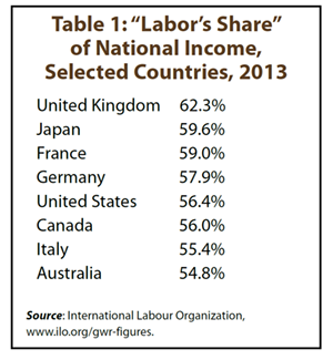
The overstatement, however, is not the same for all countries in the table. Because the salaries of executives in the United States are generally a good deal higher than those in other countries, the labor's share for this country is overstated more than for most other countries. If we could correct the data to show the share going to those we think of as "working people," the U.S. position in Table 1 would be lower.

Some other useful data give us the same general picture with some detail. Consider Table 2, showing for 2015 average hourly compensation costs in manufacturing and per capita income in U.S. dollars for nineteen relatively high income countries. (Each country in the table has a per capita income above $25,000 and a population greater than five million.) Compensation costs include direct pay, social insurance expenditures, and labor-related taxes. While it is not clear if the pay of high-level executives is included in these figures, the fact that they are presented on a per hour basis suggests that the data are for "working people."
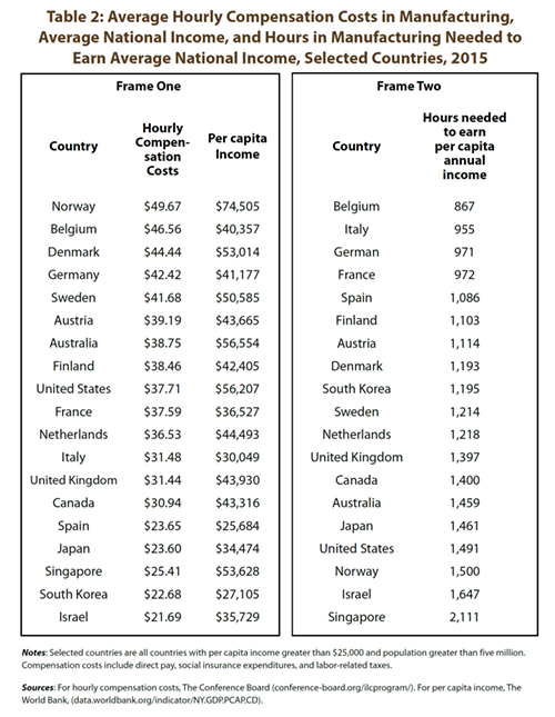
In Frame One of Table 2, countries are ranked by hourly compensation costs, and the United States falls right about in the middle. However, to a large extent (though by no means entirely) the higher hourly compensation is associated with a higher per capita income. Insofar as this is the case, we see simply that countries with high per capita incomes also have higher wages in manufacturing. No surprise. There's Norway, right at the top in terms of both hourly costs and per capita income.
But if we are interested in how workers do in the contexts of their own countries, we need to adjust for per capita income. One way to do this is to use the figures in Frame One of the table to calculate the number of hours a person receiving the average wage in manufacturing would have to work to earn the per capita annual income in the country. Things change, as shown in Frame Two of Table 2. The United States is no longer near the middle, but now ranks near the bottom. Norway falls just below the United States, along with only Israel and Singapore. So, within the context of their own countries, manufacturing workers in all the other fifteen countries fare better than manufacturing workers in the United States. Belgium, with a per capita income of 75% of that in the United States, has moved to the top of the list.
The figures in Table 2 should be viewed as very rough indicators of the actual situation. The value of wages in different countries in dollar terms can change substantially from year to year as exchange rates change. Also, manufacturing plays very different roles in different countries, and in all of the countries in the table manufacturing accounts for less than about 20% of the workforce. So the manufacturing experience is not necessarily typical for the whole economies of these countries. Nonetheless, the general implication of the table regarding the comparison of U.S. workers and workers in other countries seems reasonable and is consistent with other data--for example, data on income inequality.
The conclusion: Workers in the United States do not fare so well in relation to workers in other countries in terms of shares of their nations' incomes.